Loading...
00%
Parallel Lab
PL'25

Branding

Branding Casa De Kairos

A comprehensive brand identity for a modern wellness retreat center.

Casa de Kairos

How it happened

Casa De Kairos came to us with a clear vision but a challenging brief: create a wellness retreat brand that appeals to modern seekers without falling into the tired clichés that dominate the industry.


They didn't want lotus flowers, om symbols, or the expected earth tones. They wanted something that felt fresh, sophisticated, and grounded in authenticity. A brand that could attract a younger, more discerning audience while still honoring the depth and transformative nature of their practice.

The Real Problem

Here's what we learned in our first few conversations: the luxury watch market was kind of a mess for customers. You had fragmented retail experiences, limited access to independent watchmakers, murky pricing, and almost zero transparency about sustainability or ethics. For an industry built on precision and craftsmanship, the actual buying experience felt surprisingly chaotic.


Casa De Kairos saw an opportunity to be both curator and creator—to help customers discover amazing timepieces from other makers while building their own collection of watches that reflected their values. The name itself came from the Greek concept of kairos: qualitative time, moments that matter, as opposed to chronos (time you measure on a clock).


Which is a beautiful concept for a watch company, when you think about it.

What We
Actually Did

We started by stripping away all the assumptions about what a watch retailer "should" be. Instead of trying to be everything to everyone, we helped Casa De Kairos get clear on who they were serving and why those people should care.


We identified three distinct customer types:
  • The Connoisseur who knows what they want and respects heritage
  • The Explorer who's new to luxury watches and needs guidance
  • The Conscious Consumer who cares deeply about where their money goes
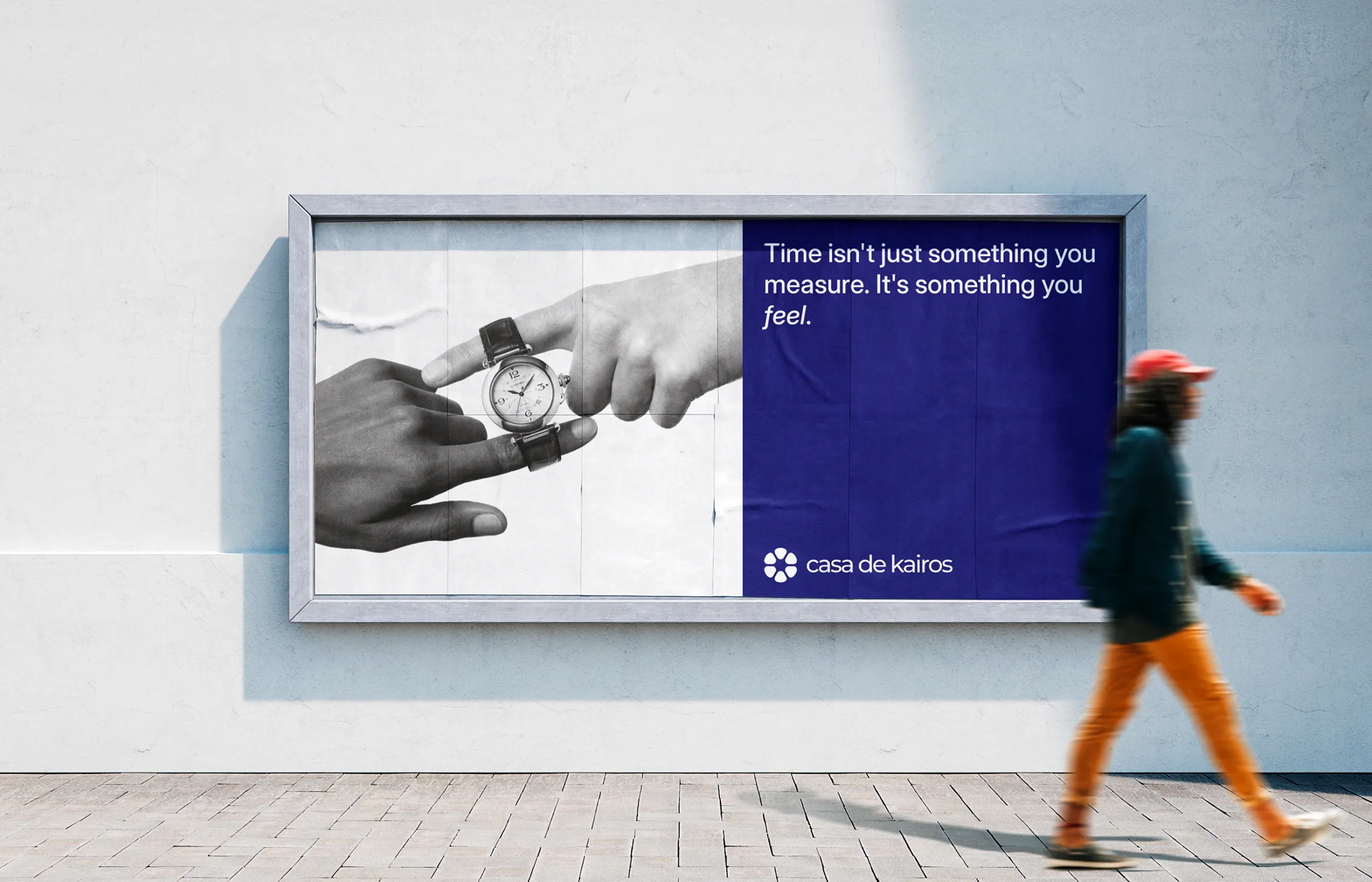
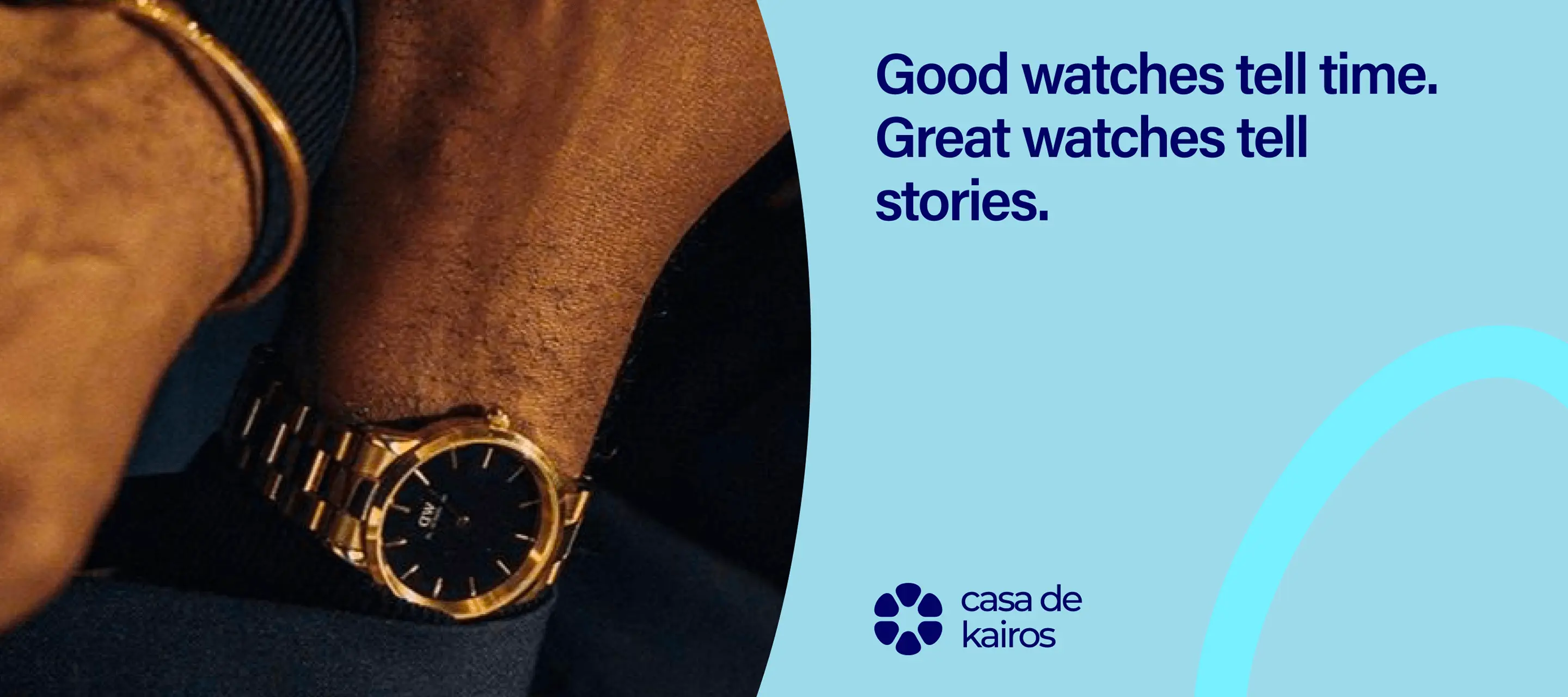
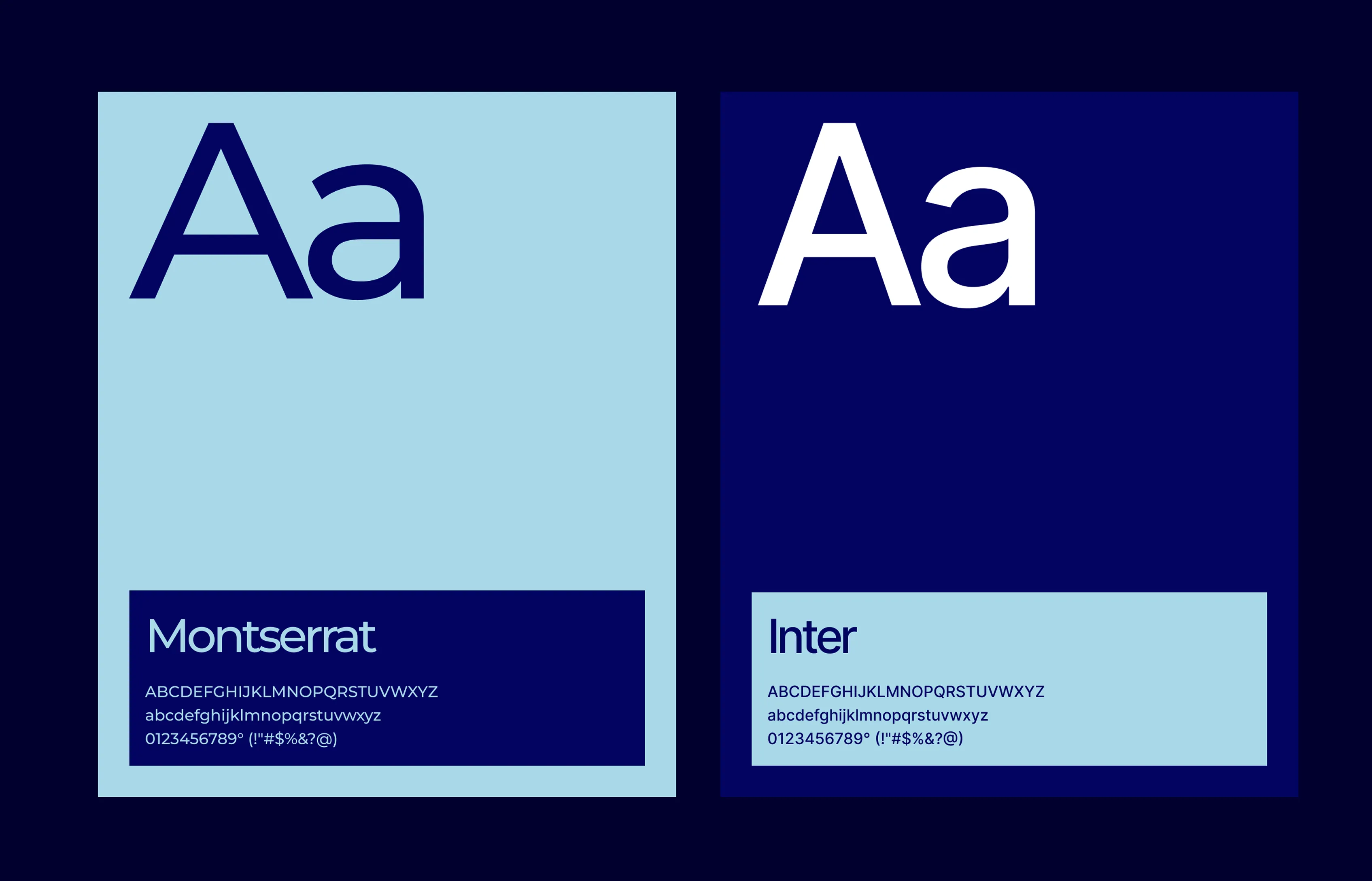
Once we knew who we were talking to, everything else started falling into place.

The Identity

The logo became six rounded petals forming a flower-like pattern. It's simple, but there's meaning baked in: six elements working together (unity), the cyclical nature of time (growth), symmetry (precision). We didn't want to hit people over the head with symbolism, but we wanted something that felt right when you looked at it.


The visual system needed to work across two very different contexts: showcasing other brands' watches (where Casa De Kairos steps back and lets the product shine) and presenting their own collection (where they could be bolder). We built flexibility into everything—typography, layouts, photography style—so the brand could shift gears without feeling disjointed.

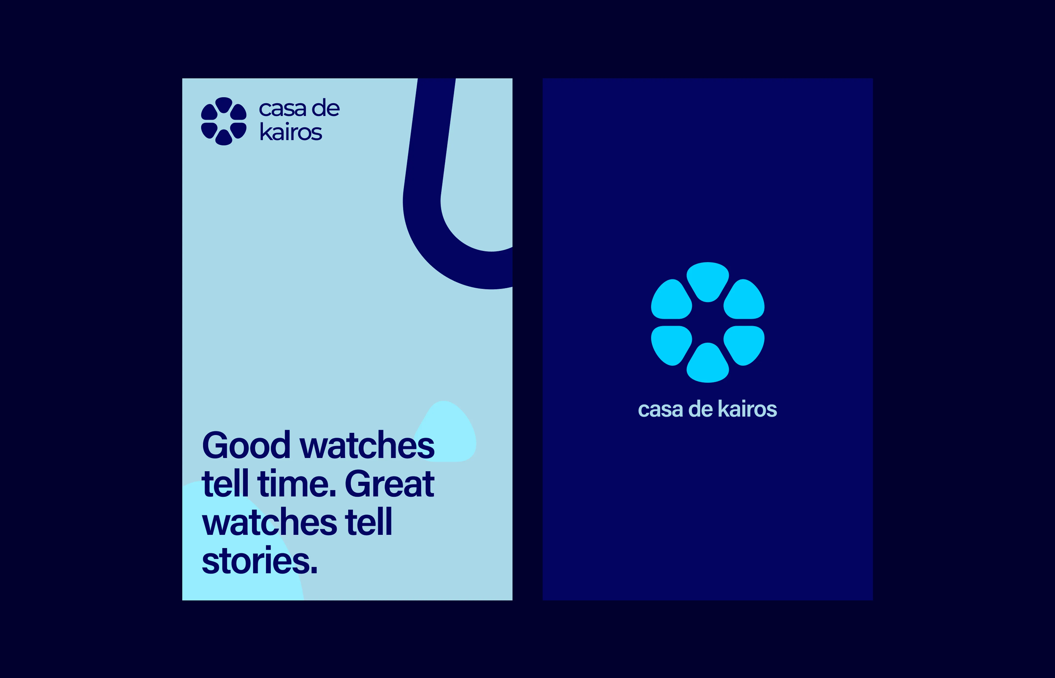
The Dual-Track Strategy

This is where it got interesting. Casa De Kairos wasn't just opening a store and slapping their logo on some watches. They were building two parallel businesses that would feed each other.

Track One:
Curation

They partnered with established watchmakers and independent artisans, carefully selecting pieces that aligned with their values—craftsmanship, innovation, ethical production. Not every watch made the cut. If it didn't meet their standards, it didn't get shelf space.

Track Two:
Creation

Their in-house collections (Heritage, Innovation, and Collaboration series) gave them creative control and let them push on sustainability in ways they couldn't with other brands. Traditional watchmaking principles, modern materials, transparent sourcing. Each piece had to earn its place in the lineup.


The magic was in how these two tracks informed each other. Selling other brands' watches taught them what customers actually wanted. Creating their own watches gave them credibility when curating others.

What We Learned

You can break industry conventions if you're solving a real problem. Casa De Kairos didn't succeed because they had a clever business model—they succeeded because they genuinely cared about making the watch buying experience better for customers and more sustainable for the planet.

The dual-track approach worked because they committed to both sides equally. They didn't half-ass the curation to push their own products, and they didn't phone in their own watch designs to focus on retail. They did both things well, and customers noticed.

Also: clarity matters more than cleverness. Every decision we made—visual identity, retail design, communication strategy—came back to simple principles. Does this help customers understand what we do? Does this reflect our values? Does this make the experience better? When you can answer yes to those questions, the work tends to be pretty good.

Next Project  →